
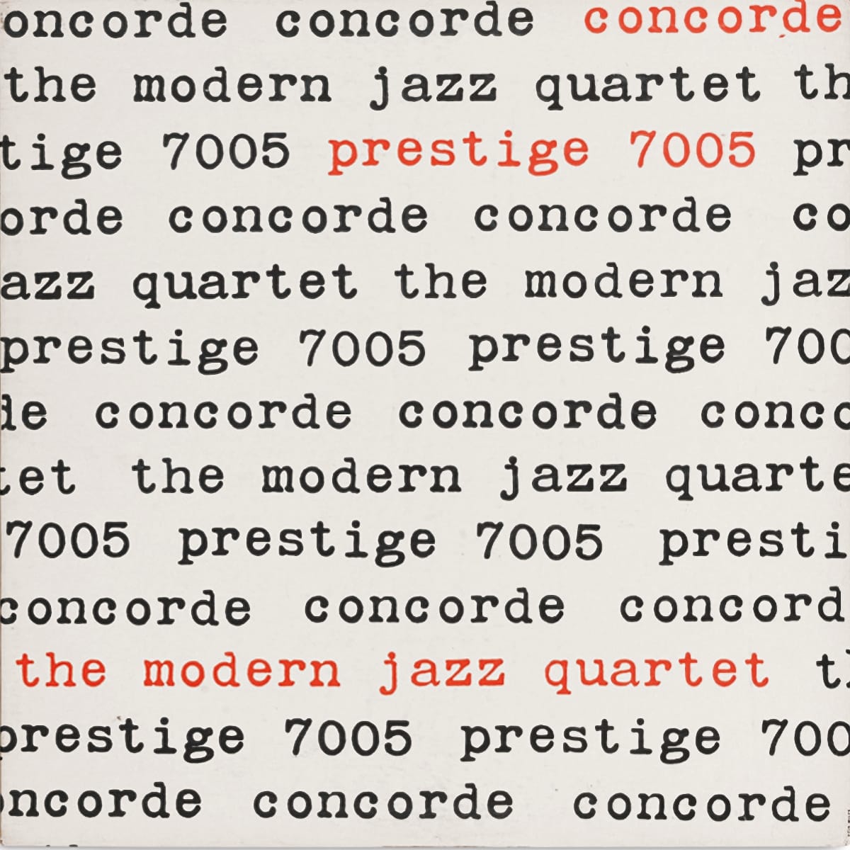
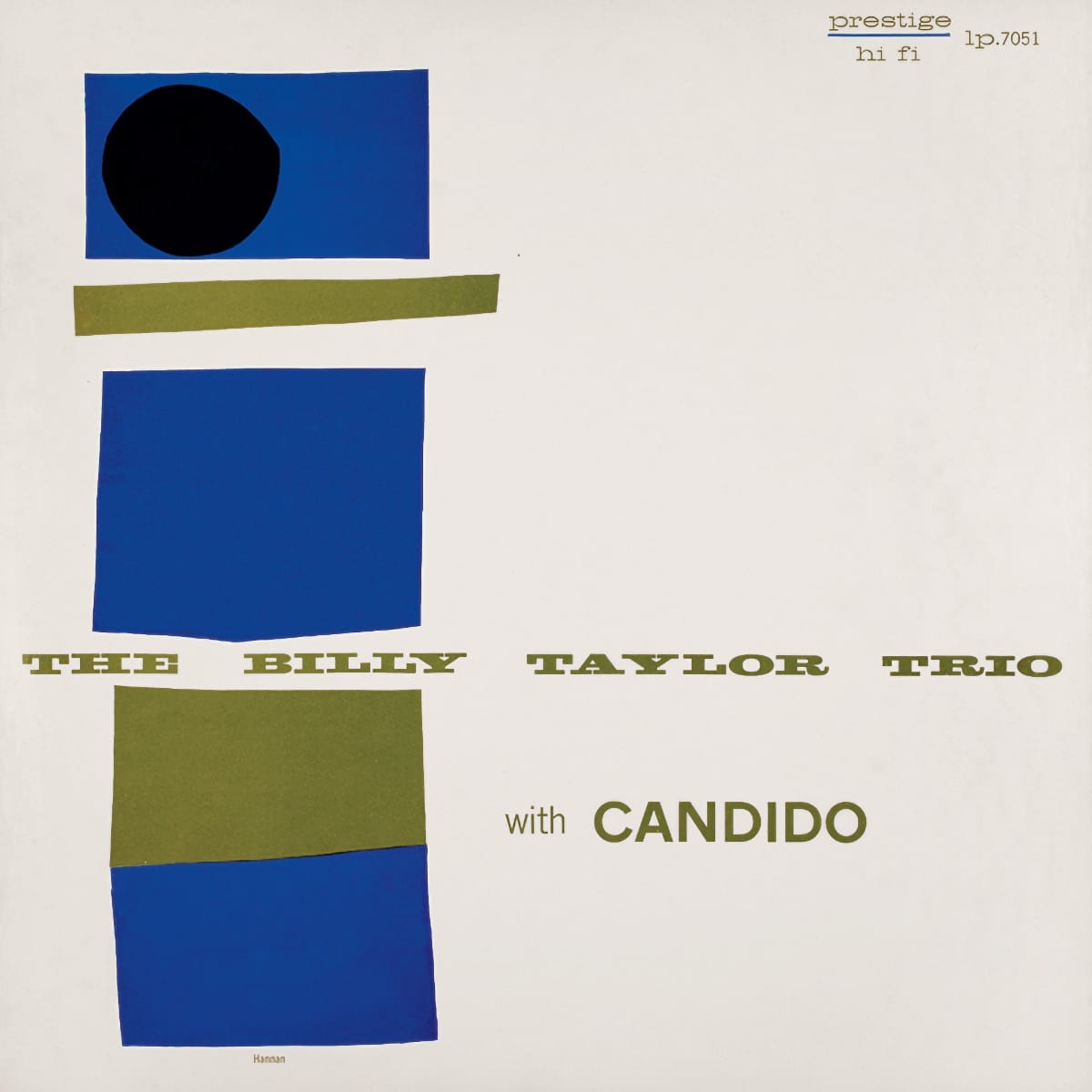
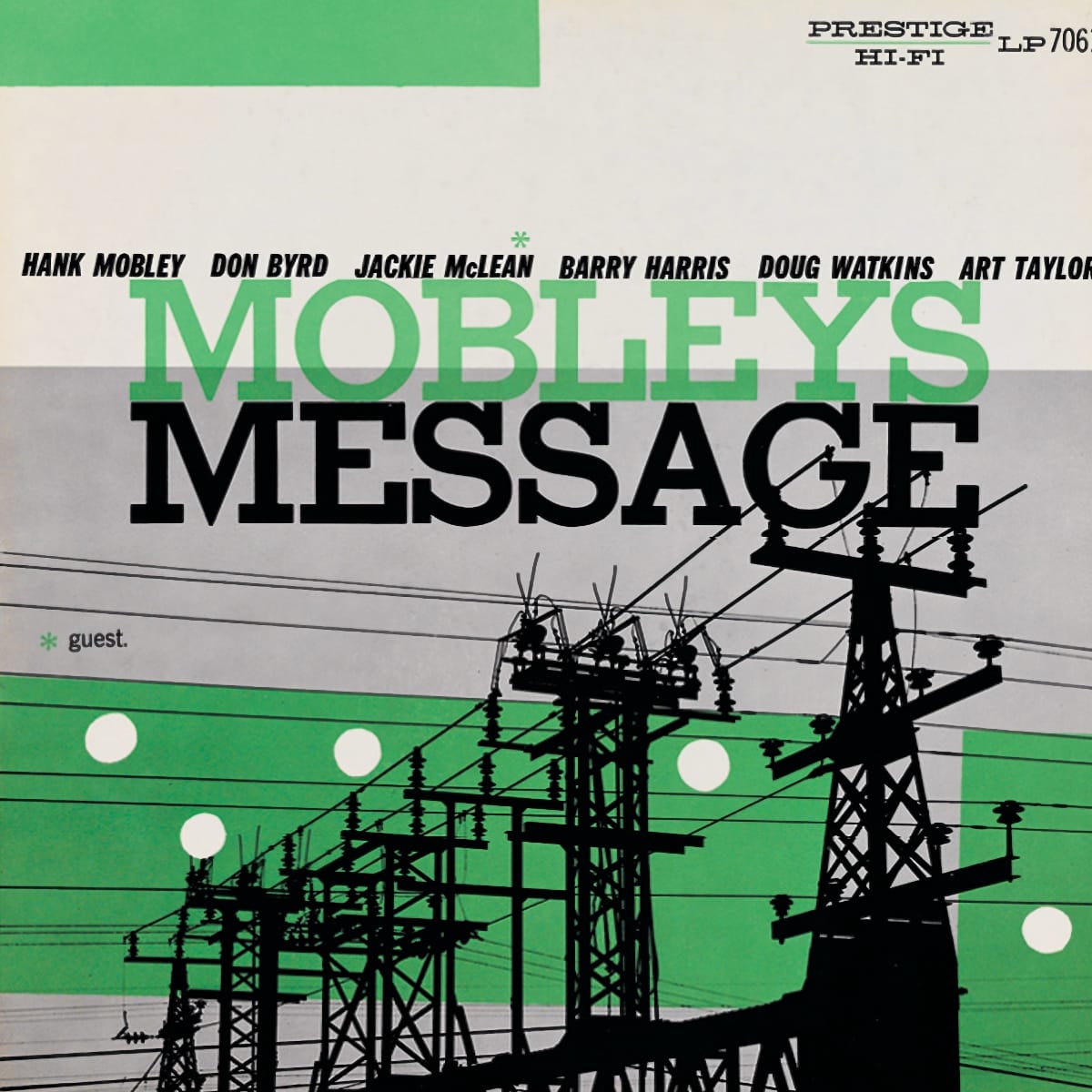
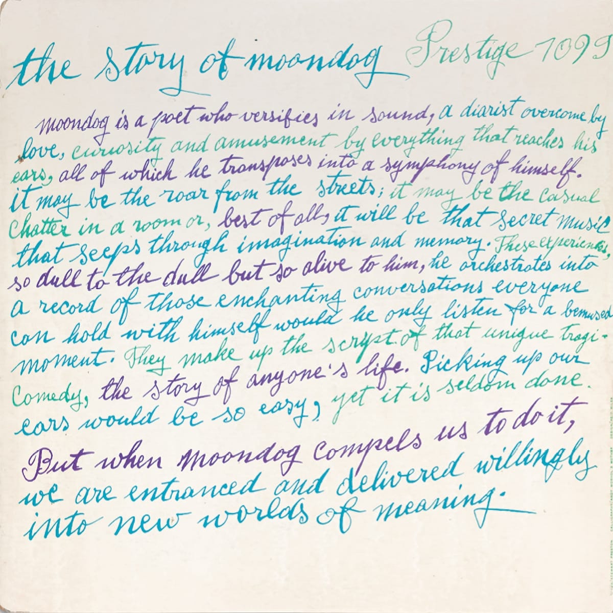
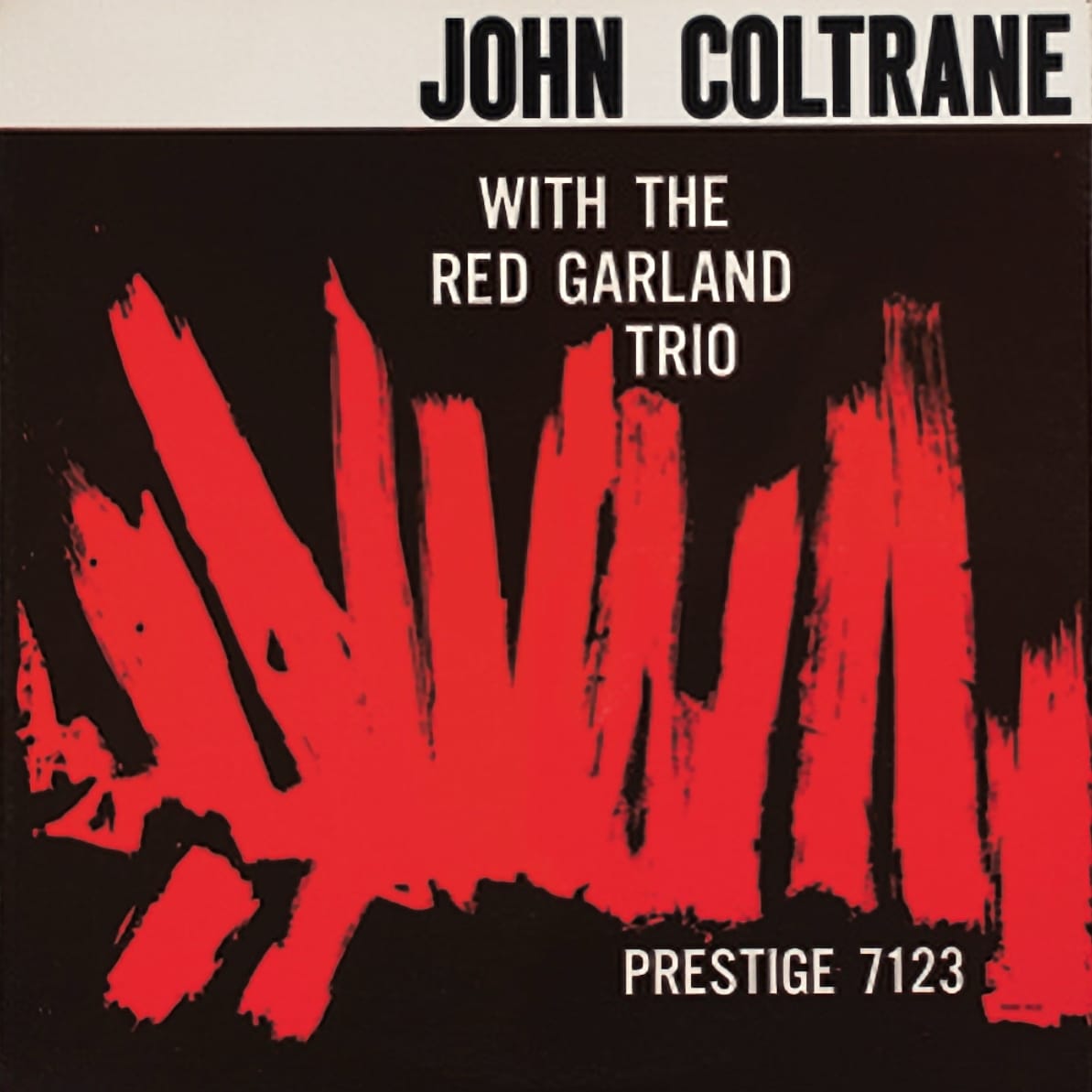
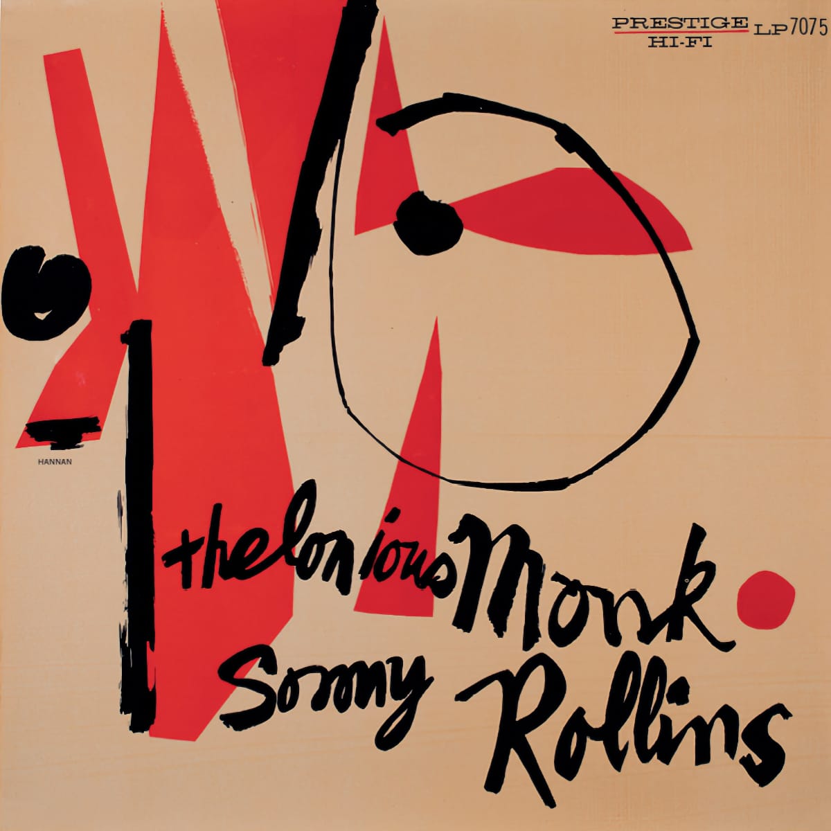
Almost from its very beginning, Prestige Records was a landmark record label, a giant in the world of jazz. Artists, including Dorothy Ashby, John Coltrane, Miles Davis, Milt Jackson, Thelonious Monk, Sonny Rollins, and other greats, released records on the New York City-based independent label founded in 1949 by Bob Weinstock. Beyond the music, Prestige album cover designs were themselves striking and innovative, drawing on the gifts of some of the era's most talented visual artists. A new book by Chris Entwistle and Mark Havens is part lavish coffee-table book, part oral history.
WAIL: The Visual Language of Prestige Records is the product of an intensive, often daunting, two-decade-long adventure in which the authors sought to locate quality copies of every record released on Prestige during the '50s. The duo also went to great lengths to locate the designers—or traces of them—to include new, firsthand perspectives on the label's often revolutionary design work. I spoke with Entwistle and Havens about the project's genesis, the paths it took, and the culmination of their work.

Bill Kopp: What inspired you to take on this project?
Chris Entwistle: Because we worked on it for so long, so many things at different points became inspirational. But initially, we felt that the design work at Prestige was especially undervalued. Right when we started this project, some books about Reid Miles's Blue Note designs had begun to appear. And that seemed to take up just about all the oxygen in terms of what people thought. But we felt that there was so much interesting stuff going on at Prestige—with some of the same designers—but people were working with a lot more freedom there. Not that it was rigid at Blue Note, but you had Francis Wolf dictating in terms of using certain photographs. We felt like it was completely open-ended at Prestige. And in the years that we worked on the book, what we discovered and what we saw was that that turned out to be true.
Mark Havens: Chris and I had taken a trip to Hackensack, where a lot of the Prestige albums had been recorded back in the 1950s. Chris and I have loved the music for so long, and because we both come from visual backgrounds, we liked the album cover art. We pored over that stuff, and the liner notes on the back just as much as we listened to the music. And we would always see, "Recorded by Van Gelder, Hackensack" on the back.
Most of these albums were recorded in Rudy Van Gelder's parents' living room. He convinced them to turn the living room into a recording studio. And we thought, "Wouldn't it be great to find that house again?" So one Saturday in the winter, we drove up to Hackensack to see if we could find where this music was recorded.
We drove around a lot. We stopped at the Hackensack Library and eventually dug up an address. We went to the address, and the only thing there is the parking lot for Hackensack Sports Medicine. I remember standing there just in disbelief. We were just looking at each other like, "Wow, there's nothing here to commemorate what happened." Some of the most important music in the American canon was captured there.
It was a very quiet ride back down the turnpike, as you might imagine. But it got us talking about some of the things that were explored as far as the music, the graphics, and the creativity at that time. Very shortly, we had the idea to do a book about Prestige album cover art.
Bill: The one-sheet promo that came with the book mentions 20 years of research. Tell me about that.
Mark: Well, a lot of things happened in between. One of the reasons that the book took a long time was that we started out with very humble ambitions: just to create a compendium of album cover art, as we had seen many times for other labels. But as we began to get into things, we realized that first of all, visually, the first printings of original editions of the albums were dramatically different from most of the reissues, and certainly from the reissues from later decades.
So it became really important to us to track down the original first edition of each album cover. That way, we could really get the idea across to the reader of what that designer intended. Because in a lot of instances—because of the lower-quality cover art printing on reissues—it wasn't really clear. So that was one of the things that took a lot of time.
And then, when we started down that road of what the designer's intent was, we wondered about the designers themselves. We would just see these very small-type last names somewhere on the front or back of the album. We wondered, "Who is Hannon? Who is David Young?" And we began to explore the possibility of tracking these people down, if they were still with us. And if not, tracking down an estate, if there is an existing estate, and a custodian of the estate, to find out more about who these people were.
Instead of just a compendium of album covers, it turned into what the book is now, which is nine different visual histories coupled with an oral history that illustrates the unique creative approach to each of the illustrators, photographers, or designers.
Along the way, we hit lots of dead ends, and we took lots of wrong turns. But an extraordinary number of generous people—from the artists themselves to folks who own certain album covers—helped us. Also, folks who didn't know anything specifically about what we were after, but said, "You ought to have a cup of coffee with this person," and connected us with someone who ended up being a lead we were looking for. There was a lot of investigative research, a lot of archaeology with this. But in the end, the book is what we envisioned.
Chris: Everything that Mark said is absolutely true. And on a personal note, as the project started to get close to 20 years, Mark would really bristle when I would point that out. He would say, "Well, what can live up to that? We've got to stop saying that! What would somebody anticipate if they saw that?"
But really, the project took on a life of its own. There were times in 2012 when we said, "You know what? We could go to press with this. This is really just about done, but we keep discovering things." As Mark said, we took so many left turns, but it would have been an entirely different book had we stopped at a certain point. So I'm grateful it took a lot of time. I hope that the book substantiates what we were doing.
Mark: One instance that I always think of is this: We were looking for an interview with Reid Miles. He was so famous for the Blue Note covers, but there's a stunning lack of specifics about him, and certainly a lack of quotes in his own words. We tracked down a couple of very brief quotes from a magazine article about him in the early 1990s, I believe. We thought, "If there are quotes in that article, maybe there was an interview done to get those quotes."
So we tracked down the author of that article, who, it turns out, wasn't a journalist anymore but had changed careers and become a gallery curator. And they said, "Yeah, I remember doing that interview. I taped the interview on two sides of a cassette, but I don't have any idea where that is, guys." And so we said, "Well, thanks. Here's all our contact information in case you run across something."
And three years later, I get a padded manila envelope in the mail with a note that just says, "Found this in a closet." We were surprised they even remembered that we asked!

Bill: What were some of the biggest challenges that you faced in the project?
Chris: We started this simply because we loved and we believed in it. The thing that we thought would be hard was getting people—the figures who did all this design—to talk to us. And that turned out to be easy. Once we made those initial connections, we spent a lot of time with these people.
I think the biggest challenge was tracking down the albums. Each of these things was photographed; we shot every one of these albums. If there's a central repository, nobody knows where it is. So we were tracking down single albums. And that's part of why it took a long time, too. Because when we started getting close to documenting just about every one—and we documented every single one we wanted to—by the end, finding them all seemed more and more unattainable. Certain album covers, we thought, "We'll never get that. We'll never be able to shoot that."
Mark: Right, because the first run always seemed to be printed in very small numbers. And then, as is mentioned in the book, Weinstock would often commission a redesign of a cover because someone who was playing as a sideman on a particular date might be gaining in popularity, so he'd put their name on the cover in big letters.
I think an equal challenge was finding some of these individuals. Some were incredibly elusive, like David X Young, who passed away before we even started the project. We tracked his daughter down in the Dominican Republic; she said that there were some boxes with estate materials, but they were in a house out on Long Island. We tried for a very long time to get into that location, but we weren't able to.
The materials were then transferred to a storage locker in Manhattan. We eventually made contact with the individual administering that estate; we set a date and had the storage locker opened. But even then, we didn't know what was there. We just knew it was boxes associated with David X Young. We were really blessed in finding a whole bunch of mock interviews and personal writings that we were able to fashion into the narrative you see in the book. And it's his own words. It's not us; it's him, actually speaking his thoughts about his work and that time in New York.
Bill: What was the biggest surprise that you encountered?
Mark: There were so many of them. For me, it was the extraordinary generosity of the people we collaborated with. Just on a handshake, people let us walk out of their houses or institutions with things that were absolutely irreplaceable. It was a tough road finding this stuff. But it really restores your faith in humanity, seeing how generous the people we eventually did track down were. They displayed so much openness and willingness to help the project along.
Chris: I completely agree with that. At the beginning, we just thought this stuff was undervalued; we didn't go into it with a theory beyond that. What we intuitively thought was that this was a really unique body of work. And it was. Even though it wasn't unified by the kinds of things that you typically think of in design, you could start to recognize a kind of explosive creativity, something that wasn't happening at other labels.
Bill: What would you say is the lasting significance of the body of album cover art that came out of Prestige?
Mark: The techniques and the results that these artists collectively achieved using Prestige as the means to do it are a towering graphic achievement. There are techniques that are still being used today, being done today, being imitated today unknowingly. Weinstock's got a quote in the book that says, "I treated it all as art: the music and the covers." And if it wasn't for Weinstock's extraordinary willingness to embrace that inherent vagueness and ambiguity of navigating all those different creative processes from these artists, there's no way you'd be able to intentionally curate a body of work that resulted from him going, "You know what? I'm gonna let the artists be the artists."
Check out more like this:


Comments